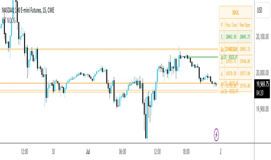
Weekly Opening Range and Previous Data for FuturesThis indicator will not predict future price action.
This indicator is a time based range tool. These types of tools are great to use when there is not any historical data to look back on (as in all time highs/lows). The user can use this indicator to measure distributions, use deviations of the range to identify support/resistance levels, and see how historical price action influences current price action. This indicator is unique because it uses the price range from the open of the futures market on Sunday 18:00 America/New York to the open of the Bond Market 8:00 America/New York as the range for all calculations.
This indicator collects the multiple points of data from each day of the week, and gives the user many options on how to use the data that is collected. The amount of data collected is based on the time frame of the chart (best used on a 15 minute chart), but is limited to 30 minute charts.
Data Collected:
Opening Range for the week
High of Each Day
Low of Each Day
Close of Each Day
Initially the range is plotted on the chart as a box, when the Bond market opens the high/low/mid is plotted, as well as the current week open and previous week close.
How the data is used.
Intraday: Monday does not have a previous day to pull data on, so all data for Monday is intraday data. When a new high is made, the indicator will search all previous data in the lookback period for the current day , find all highs that are within a set variance (determined by the user), and plot the corresponding lows from the matching days. It will do the same for new lows that are made, with corresponding historical highs. All of these levels are plotted on the chart, as well as the Average High, Average Low. If price moves beyond either Average, the Average of all days that distributed higher than the Average is plotted on the chart as Min/Max Average.
Previous Day Data: Tuesday - Friday. After the close of the day, the user has the option to choose either the High, Low, or Close of that day to find previous data that matches within a variance determined by the user; or an option to find the n closest matches (up to 20). That data is then matched to the corresponding next day data and plotted on the chart as a box. Example: Monday closes at +1 Deviation (Dev) of the Weekly Opening Range (WOR). The user sets the variance at 0.5 (0.5 Dev of the WOR), the indicator will search the lookback period for all Mondays that closed between 1.25 Dev and 0.75 Dev of the WOR. The matching Mondays will then be matched to their corresponding Tuesdays and the data for the High and Low from those Tuesdays will be placed on the chart as a box overlaying the current Tuesday. Each match is numbered so that corresponding Highs and Lows of each historical day can be identified. The same can be done for either the High or Low of the Previous Day.
The indicator has a table that can be shown.
Data shown in table:
Current Extension of the WOR
Maximum Extension of the WOR
Average WOR in %
Current WOR in %
Average Range for the day in % based on data set
Current Range for the day in %
Number of days in the data set
Number of Previous Day Matches
Variance for previous day data
Number of Intraday High Matches
Number of Intraday Low Matches
Variance for Intraday Matches
The table as well as all lines and boxes have the option of being shown or not, as well as have their settings customized to fit the users chart layout.
As with any indicator, do not let the data shown change your trading model. Past performance is not indicative to future performance.
ค้นหาในสคริปต์สำหรับ " TABLE "

Simple Decesion Matrix Classification Algorithm [SS]Hello everyone,
It has been a while since I posted an indicator, so thought I would share this project I did for fun.
This indicator is an attempt to develop a pseudo Random Forest classification decision matrix model for Pinescript.
This is not a full, robust Random Forest model by any stretch of the imagination, but it is a good way to showcase how decision matrices can be applied to trading and within Pinescript.
As to not market this as something it is not, I am simply calling it the "Simple Decision Matrix Classification Algorithm". However, I have stolen most of the aspects of this machine learning algo from concepts of Random Forest modelling.
How it works:
With models like Support Vector Machines (SVM), Random Forest (RF) and Gradient Boosted Machine Learning (GBM), which are commonly used in Machine Learning Classification Tasks (MLCTs), this model operates similarity to the basic concepts shared amongst those modelling types. While it is not very similar to SVM, it is very similar to RF and GBM, in that it uses a "voting" system.
What do I mean by voting system?
How most classification MLAs work is by feeding an input dataset to an algorithm. The algorithm sorts this data, categorizes it, then introduces something called a confusion matrix (essentially sorting the data in no apparently order as to prevent over-fitting and introduce "confusion" to the algorithm to ensure that it is not just following a trend).
From there, the data is called upon based on current data inputs (so say we are using RSI and Z-Score, the current RSI and Z-Score is compared against other RSI's and Z-Scores that the model has saved). The model will process this information and each "tree" or "node" will vote. Then a cumulative overall vote is casted.
How does this MLA work?
This model accepts 2 independent variables. In order to keep things simple, this model was kept as a three node model. This means that there are 3 separate votes that go in to get the result. A vote is casted for each of the two independent variables and then a cumulative vote is casted for the overall verdict (the result of the model's prediction).
The model actually displays this system diagrammatically and it will likely be easier to understand if we look at the diagram to ground the example:
In the diagram, at the very top we have the classification variable that we are trying to predict. In this case, we are trying to predict whether there will be a breakout/breakdown outside of the normal ATR range (this is either yes or no question, hence a classification task).
So the question forms the basis of the input. The model will track at which points the ATR range is exceeded to the upside or downside, as well as the other variables that we wish to use to predict these exceedences. The ATR range forms the basis of all the data flowing into the model.
Then, at the second level, you will see we are using Z-Score and RSI to predict these breaks. The circle will change colour according to "feature importance". Feature importance basically just means that the indicator has a strong impact on the outcome. The stronger the importance, the more green it will be, the weaker, the more red it will be.
We can see both RSI and Z-Score are green and thus we can say they are strong options for predicting a breakout/breakdown.
So then we move down to the actual voting mechanisms. You will see the 2 pink boxes. These are the first lines of voting. What is happening here is the model is identifying the instances that are most similar and whether the classification task we have assigned (remember out ATR exceedance classifier) was either true or false based on RSI and Z-Score.
These are our 2 nodes. They both cast an individual vote. You will see in this case, both cast a vote of 1. The options are either 1 or 0. A vote of 1 means "Yes" or "Breakout likely".
However, this is not the only voting the model does. The model does one final vote based on the 2 votes. This is shown in the purple box. We can see the final vote and result at the end with the orange circle. It is 1 which means a range exceedance is anticipated and the most likely outcome.
The Data Table Component
The model has many moving parts. I have tried to represent the pivotal functions diagrammatically, but some other important aspects and background information must be obtained from the companion data table.
If we bring back our diagram from above:
We can see the data table to the left.
The data table contains 2 sections, one for each independent variable. In this case, our independent variables are RSI and Z-Score.
The data table will provide you with specifics about the independent variables, as well as about the model accuracy and outcome.
If we take a look at the first row, it simply indicates which independent variable it is looking at. If we go down to the next row where it reads "Weighted Impact", we can see a corresponding percent. The "weighted impact" is the amount of representation each independent variable has within the voting scheme. So in this case, we can see its pretty equal, 45% and 55%, This tells us that there is a slight higher representation of z-score than RSI but nothing to worry about.
If there was a major over-respresentation of greater than 30 or 40%, then the model would risk being skewed and voting too heavily in favour of 1 variable over the other.
If we move down from there we will see the next row reads "independent accuracy". The voting of each independent variable's accuracy is considered separately. This is one way we can determine feature importance, by seeing how well one feature augments the accuracy. In this case, we can see that RSI has the greatest importance, with an accuracy of around 87% at predicting breakouts. That makes sense as RSI is a momentum based oscillator.
Then if we move down one more, we will see what each independent feature (node) has voted for. In this case, both RSI and Z-Score voted for 1 (Breakout in our case).
You can weigh these in collaboration, but its always important to look at the final verdict of the model, which if we move down, we can see the "Model prediction" which is "Bullish".
If you are using the ATR breakout, the model cannot distinguish between "Bullish" or "Bearish", must that a "Breakout" is likely, either bearish or bullish. However, for the other classification tasks this model can do, the results are either Bullish or Bearish.
Using the Function:
Okay so now that all that technical stuff is out of the way, let's get into using the function. First of all this function innately provides you with 3 possible classification tasks. These include:
1. Predicting Red or Green Candle
2. Predicting Bullish / Bearish ATR
3. Predicting a Breakout from the ATR range
The possible independent variables include:
1. Stochastics,
2. MFI,
3. RSI,
4. Z-Score,
5. EMAs,
6. SMAs,
7. Volume
The model can only accept 2 independent variables, to operate within the computation time limits for pine execution.
Let's quickly go over what the numbers in the diagram mean:
The numbers being pointed at with the yellow arrows represent the cases the model is sorting and voting on. These are the most identical cases and are serving as the voting foundation for the model.
The numbers being pointed at with the pink candle is the voting results.
Extrapolating the functions (For Pine Developers:
So this is more of a feature application, so feel free to customize it to your liking and add additional inputs. But here are some key important considerations if you wish to apply this within your own code:
1. This is a BINARY classification task. The prediction must either be 0 or 1.
2. The function consists of 3 separate functions, the 2 first functions serve to build the confusion matrix and then the final "random_forest" function serves to perform the computations. You will need all 3 functions for implementation.
3. The model can only accept 2 independent variables.
I believe that is the function. Hopefully this wasn't too confusing, it is very statsy, but its a fun function for me! I use Random Forest excessively in R and always like to try to convert R things to Pinescript.
Hope you enjoy!
Safe trades everyone!

Predict Trend [Cometreon]Predict Trend is a forward-looking indicator that compares the current market trend with historical patterns, providing statistically based forecasts. Using advanced algorithms, it continuously scans for price behaviors similar to those in the past and projects average outcomes based on those patterns.
This innovative approach offers traders a powerful tool to anticipate market movements, refine strategies, and make data-driven decisions.
🔷 Key Features
🟩 Historical Pattern Analysis:
The indicator identifies and compares the current trend with similar historical patterns, providing predictions based on concrete and historical data.
🟩 Customizable Precision:
Offers the ability to adjust various parameters such as distance and percentage variation between levels, improving the accuracy of pattern search.
🟩 Historical Average-Based Predictions:
Displays the predicted movement based on the average of all historical patterns found, allowing for informed trading decisions.
🟩 Specific Pattern Search:
In addition to automatic search based on the active trend, Predict allows searching for specific patterns by manually entering the necessary data for analysis.
🟩 Forecast Visualization:
Provides a detailed table with all values found and a line representing the average of results, offering a clear view of predictions based on historical data.
🔷 Technical Details and Customizable Inputs
1️⃣ Precision Parameters - Allows adjusting the length of levels, pattern precision, and the number of subsequent values to obtain after identifying historical patterns.
2️⃣ Specific Pattern Search - Allows manual data entry to search for specific patterns, offering greater flexibility in analysis.
3️⃣ Timeframe - Predict works on any timeframe, with greater precision on higher timeframes.
4️⃣ Chart Compatibility - It is compatible with all chart types, allowing analysis and comparison of historical patterns regardless of the chart type used.
5️⃣ Level 1 - First correlation level for patterns. "Last Bar to Check" allows choosing the number of Pivots to check for searching patterns in the past with the same values (e.g., HH, LL, LH, and HL).
6️⃣ Level 2 - Checks the candle distance between each level. "Error Value Up-Down" allows adding a margin value between distances.
7️⃣ Level 3 - Verifies the percentage distance between levels. "Error Percent" allows adding an error margin to the percentage distance.
8️⃣ Bar to Have - Determines how many values after each pattern to display in the table.
9️⃣ Timezone - Enter the chart's time zone to display the precise start time of the pattern.
🔟 Manual Search - Allows searching for specific patterns by manually entering up to 8 values, including special values such as:
High Value : "HH" (Higher High) or "LH" (Lower High)
Low Value : "LL" (Lower Low) or "HL" (Higher Low)
Top / Bottom : "HH" or "LL"
Mid Level : "LH" or "HL"
1️⃣1️⃣ Approximate Trend - Shows a trend based on the average of values for each pattern in each section. Allows customizing up to 4 colors, line thickness, and style.
1️⃣2️⃣ Pattern Table - Shows the values of identified patterns. You can customize the number of patterns to show, display order, position, size, and table style.
1️⃣3️⃣ Displayed Elements - Customize elements shown on the table, such as Number, Date, or subsequent Swing values.
1️⃣4️⃣ Style Label - Modify the visual appearance of labels by selecting colors for background and text.
These options allow optimizing the indicator for different trading styles and market conditions, ensuring accurate and customized technical analysis.
🔍 How to Use Predict Trend
📌 Past Movement Analysis
Use the patterns found to compare past movements with the current trend, gaining a clear vision of possible future directions.
📊 Using Value Averages
Analyze the average of values from found patterns to get a more direct and synthetic view of past market behavior.
🎯 Specific Pattern Search
In addition to automatic search based on the active trend, Predict allows searching for specific patterns by entering the necessary data for targeted analysis.
☄️ With Predict Trend , you can simplify your market analysis, saving time and improving the accuracy of your decisions with predictions based on concrete and verifiable historical data.
Don't waste any more time and take advantage of the precision of historical pattern analysis to gain a competitive edge in the market.

Forex Heatmap█ OVERVIEW
This indicator creates a dynamic grid display of currency pair cross rates (exchange rates) and percentage changes, emulating the Cross Rates and Heat Map widgets available on our Forex page. It provides a view of realtime exchange rates for all possible pairs derived from a user-specified list of currencies, allowing users to monitor the relative performance of several currencies directly on a TradingView chart.
█ CONCEPTS
Foreign exchange
The Foreign Exchange (Forex/FX) market is the largest, most liquid financial market globally, with an average daily trading volume of over 5 trillion USD. Open 24 hours a day, five days a week, it operates through a decentralized network of financial hubs in various major cities worldwide. In this market, participants trade currencies in pairs , where the listed price of a currency pair represents the exchange rate from a given base currency to a specific quote currency . For example, the "EURUSD" pair's price represents the amount of USD (quote currency) that equals one unit of EUR (base currency). Globally, the most traded currencies include the U.S. dollar (USD), Euro (EUR), Japanese yen (JPY), British pound (GBP), and Australian dollar (AUD), with USD involved in over 87% of all trades.
Understanding the Forex market is essential for traders and investors, even those who do not trade currency pairs directly, because exchange rates profoundly affect global markets. For instance, fluctuations in the value of USD can impact the demand for U.S. exports or the earnings of companies that handle multinational transactions, either of which can affect the prices of stocks, indices, and commodities. Additionally, since many factors influence exchange rates, including economic policies and interest rate changes, analyzing the exchange rates across currencies can provide insight into global economic health.
█ FEATURES
Requesting a list of currencies
This indicator requests data for every valid currency pair combination from the list of currencies defined by the "Currency list" input in the "Settings/Inputs" tab. The list can contain up to six unique currency codes separated by commas, resulting in a maximum of 30 requested currency pairs.
For example, if the specified "Currency list" input is "CAD, USD, EUR", the indicator requests and displays relevant data for six currency pair combinations: "CADUSD", "USDCAD", "CADEUR", "EURCAD", "USDEUR", "EURUSD". See the "Grid display" section below to understand how the script organizes the requested information.
Each item in the comma-separated list must represent a valid currency code. If the "Currency list" input contains an invalid currency code, the corresponding cells for that currency in the "Cross rates" or "Heat map" grid show "NaN" values. If the list contains empty items, e.g., "CAD, ,EUR, ", the indicator ignores them in its data requests and calculations.
NOTE: Some uncommon currency pair combinations might not have data feeds available. If no available symbols provide the exchange rates between two specified currencies, the corresponding table cells show "NaN" results.
Realtime data
The indicator retrieves realtime market prices, daily price changes, and minimum tick sizes for all the currency pairs derived from the "Currency list" input. It updates the retrieved information shown in its grid display after new ticks become available to reflect the latest known values.
NOTE: Pine scripts execute on realtime bars only when new ticks are available in the chart's data feed. If no new updates are available from the chart's realtime feed, it may cause a delay in the data the indicator receives.
Grid display
This indicator displays the requested data for each currency pair in a table with cells organized as a grid. Each row name corresponds to a pair's base currency , and each column name corresponds to a quote currency . The cell at the intersection of a specific row and column shows the value requested from the corresponding currency pair.
For example, the cell at the intersection of a "EUR" row and "USD" column shows the data retrieved for the "EURUSD" currency pair, and the cell at the "USD" row and "EUR" column shows data for the inverse pair ("USDEUR").
Note that the main diagonal cells in the table, where rows and columns with the same names intersect, are blank. The exchange rate from one currency to itself is always 1, and no Forex symbols such as "EUREUR" exist.
The dropdown input at the top of the "Settings/Inputs" tab determines the type of information displayed in the table. Two options are available: "Cross rates" and "Heat map" . Both modes color their cells for light and dark themes separately based on the inputs in the "Colors" section.
Cross rates
When a user selects the "Cross rates" display mode, the table's cells show the latest available exchange rate for each currency pair, emulating the behavior of the Cross Rates widget. Each cell's value represents the amount of the quote currency (column name) that equals one unit of the base currency (row name). This display allows users to compare cross rates across currency pairs, and their inverses.
The background color of each cell changes based on the most recent update to the exchange rate, allowing users to monitor the direction of short-term fluctuations as they occur. By default, the background turns green (positive cell color) when the cross rate increases from the last recorded update and red (negative cell color) when the rate decreases. The cell's color reverts to the chart's background color after no new updates are available for 200 milliseconds.
Heat map
When a user selects the "Heat map" display mode, the table's cells show the latest daily percentage change of each currency pair, emulating the behavior of the Heat Map widget.
In this mode, the background color of each cell depends on the corresponding currency pair's daily performance. Heat maps typically use colors that vary in intensity based on the calculated values. This indicator uses the following color coding by default:
• Green (Positive cell color): Percentage change > +0.1%
• No color: Percentage change between 0.0% and +0.1%
• Bright red (Negative cell color): Percentage change < -0.1%
• Lighter/darker red (Minor negative cell color): Percentage change between 0.0% and -0.1%
█ FOR Pine Script™ CODERS
• This script utilizes dynamic requests to iteratively fetch information from multiple contexts using a single request.security() instance in the code. Previously, `request.*()` functions were not allowed within the local scopes of loops or conditional structures, and most `request.*()` function parameters, excluding `expression`, required arguments of a simple or weaker qualified type. The new `dynamic_requests` parameter in script declaration statements enables more flexibility in how scripts can use `request.*()` calls. When its value is `true`, all `request.*()` functions can accept series arguments for the parameters that define their requested contexts, and `request.*()` functions can execute within local scopes. See the Dynamic requests section of the Pine Script™ User Manual to learn more.
• Scripts can execute up to 40 unique `request.*()` function calls. A `request.*()` call is unique only if the script does not already call the same function with the same arguments. See this section of the User Manual's Limitations page for more information.
• Typically, when requesting higher-timeframe data with request.security() using barmerge.lookahead_on as the `lookahead` argument, the `expression` argument should use the history-referencing operator to offset the series, preventing lookahead bias on historical bars. However, the request.security() call in this script uses barmerge.lookahead_on without offsetting the `expression` because the script only displays results for the latest historical bar and all realtime bars, where there is no future information to leak into the past. Instead, using this call on those bars ensures each request fetches the most recent data available from each context.
• The request.security() instance in this script includes a `calc_bars_count` argument to specify that each request retrieves only a minimal number of bars from the end of each symbol's historical data feed. The script does not need to request all the historical data for each symbol because it only shows results on the last chart bar that do not depend on the entire time series. In this case, reducing the retrieved bars in each request helps minimize resource usage without impacting the calculated results.
Look first. Then leap.

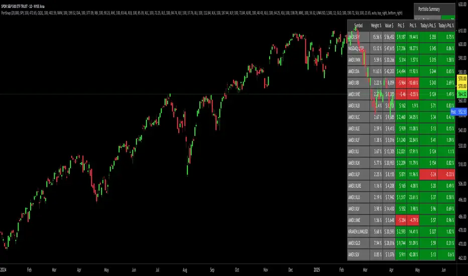
Portfolio SnapShot v0.3Here is a Tradingview Pinescript that I call "Portfolio Snapshot". It is based on two other separate scripts that I combined, modified and simplified - shoutout to RedKTrader (Portfolio Tracker - Table Version) and FriendOfTheTrend (Portfolio Tracker For Stocks & Crypto) for their inspiration and code. I was using both of these scripts, and decided to combine the two and increase the number of stocks to 20. I was looking for an easy way to track my entire portfolio (scattered across 5 accounts) PnL on a total and stock basis. PnL - that's it, very simple by design. The features are:
1) Track PnL across multiple accounts, from inception and current day.
2) PnL is reported in two tables, at the portfolio level and individual stock level
3) Both tables can be turned on/off and placed anywhere on the chart.
4) Input up to 20 assets (stocks, crypto, ETFs)
The user has to manually calculate total shares and average basis for stocks in multiple accounts, and then inputs this in the user input dialog. I update mine as each trade is made, or you can just update once a week or so.
I've pre-loaded it with the major indices and sector ETFs, plus URA, GLD, SLV. 100 shares of each, and prices are based on the close Jan 2 2024. So if you don't want to track your portfolio, you can use it to track other things you find interesting, such as annual performance of each sector.
MTF RSI+CMO PROThis RSI+CMO script combines the Relative Strength Index (RSI) and Chande Momentum Oscillator (CMO), providing a powerful tool to help traders analyze price momentum and spot potential turning points in the market. Unlike using RSI alone, the CMO (especially with a 14-period length) moves faster and accentuates price pops and dips in the histogram, making price shifts more apparent.
Indicator Features:
➡️RSI and CMO Combined: This indicator allows traders to track both RSI and CMO values simultaneously, highlighting differences in their movement. RSI and CMO values are both plotted on the histogram, while CMO values are also drawn as a line moving through the histogram, giving a visual representation of their relationship. The often faster-moving CMO accentuates short-term price movements, helping traders spot subtle shifts in momentum that the RSI might smooth out.
➡️Multi-Time Frame Table: A real-time, multi-time frame table displays RSI and CMO values across various timeframes. This gives traders an overview of momentum across different intervals, making it easier to spot trends and divergences across short and long-term time frames.
➡️Momentum Chart Label: A chart label compares the current RSI and CMO values with values from 1 and 2 bars back, providing an additional metric to gauge momentum. This feature allows traders to easily see if momentum is increasing or decreasing in real-time.
➡️RSI/CMO Bullish and Bearish Signals: Colored arrow plot shapes (above the histogram) indicate when RSI and CMO values are signaling bullish or bearish conditions. For example, green arrows appear when RSI is above 65, while purple arrows show when RSI is below 30 and CMO is below -40, indicating strong bearish momentum.
➡️Divergences in Histogram: The histogram can make it easier for traders to spot divergences between price and momentum. For instance, if the price is making new highs but the RSI or CMO is not, a bearish divergence may be forming. Similarly, bullish divergences can be spotted when prices are making lower lows while RSI or CMO is rising.
➡️Alert System: Alerts are built into the indicator and will trigger when specific conditions are met, allowing traders to stay informed of potential entry or exit points based on RSI and CMO levels without constantly monitoring the chart. These are set manually. Look for the 3 dots in the indicator name.
How Traders Can Use the Indicator:
💥Identifying Momentum Shifts: The RSI+CMO combination is ideal for spotting momentum shifts in the market. Traders can monitor the histogram and the CMO line to determine if the market is gaining or losing strength.
💥Confirming Trade Entries/Exits: Use the real-time RSI and CMO values across multiple time frames to confirm trades. For instance, if the 1-hour RSI is above 70 but the 1-minute RSI is turning down, it could indicate short-term overbought conditions, signaling a potential exit or reversal.
💥Spotting Divergences: Divergences are critical for predicting potential reversals. The histogram can be used to spot divergences when RSI and CMO values deviate from price action, offering an early signal of market exhaustion.
💥Tracking Multi-Time Frame Trends: The multi-time frame table provides insight into the market’s overall trend across several timeframes, helping traders ensure their decisions align with both short and long-term trends.
RSI vs. CMO: Why Use Both?
While both RSI and CMO measure momentum, the CMO often moves faster with a value of 14 for example, reacting to price changes more quickly. This makes it particularly effective for detecting sharp price movements, while RSI helps smooth out price action. By using both, traders get a clearer picture of the market's momentum, particularly during volatile periods.
Confluence and Price Fluidity:
One of the powerful ways to enhance the effectiveness of this indicator is by using it in conjunction with other technical analysis tools to create confluence. Confluence occurs when multiple indicators or price action signals align, providing stronger confirmation for a trade decision. For example:
🎯Support and Resistance Levels: Traders can use RSI+CMO in combination with key support and resistance zones. If the price is nearing a support level and RSI+CMO values start to signal a bullish reversal, this alignment strengthens the case for entering a long position.
🎯Moving Averages: When the RSI+CMO signals a potential trend reversal and this is confirmed by a crossover in moving averages (such as a 50-day and 200-day moving average), traders gain additional confidence in the trade direction.
🎯Momentum Indicators: Traders can also look for momentum indicators like the MACD to confirm the strength of a trend or potential reversal. For instance, if the RSI+CMO values start to decrease rapidly while both the RSI+CMO also shows overbought conditions, this could provide stronger confirmation to exit a long trade or enter a short position.
🎯Candlestick Patterns: Price fluidity can be monitored using candlestick formations. For example, a bearish engulfing pattern with decreasing RSI+CMo values offers confluence, adding confidence to the signal to close or short the trade.
By combining the MTF RSI+CMO PRO with other tools, traders ensure that they are not relying on a single indicator. This layered approach can reduce the likelihood of false signals and improve overall trading accuracy.

NYSE UVOL RatioThis Pine Script is designed to monitor and display the ratio of advancing volume (UVOL) to declining volume (DVOL) on the NYSE in real-time on your TradingView charts. Here's a breakdown of what each part of the script does:
Indicator Declaration: The script starts by declaring an indicator called "NYSE UVOL" with the option to overlay it directly on the price chart. This allows you to see the volume ratio in context with price movements.
Volume Data Fetching:
Advancing Volume (UVOL): It retrieves the closing value of the advancing volume from the NYSE.
Declining Volume (DVOL): It fetches the closing value of the declining volume.
Ratio Calculation:
The script calculates the ratio of advancing to declining volume. To avoid division by zero, it checks if the declining volume is not zero before performing the division.
Color Coding:
The script assigns a color to the ratio value based on set thresholds:
Red for a ratio less than 1 (more declining than advancing volume).
White for ratios between 1 and 2.
Lime for ratios between 2 and 3.
Green for ratios above 3.
Display Table:
A table is created in the top-right corner of the chart to display the current ratio value.
It updates this table with the latest ratio value at each new bar, displaying the ratio with appropriate color coding for quick reference.
This script provides a visual and numerical representation of market sentiment based on volume data, aiding traders in assessing the balance between buying and selling pressure.
Market Trades PinescriptlabsThis algorithm is designed to emulate the true order book of exchanges by showing the quantity of transactions of an asset in real-time, while identifying patterns of high activity and volatility in the market through the analysis of volume and price movements. 📈 Below, I explain how to understand and use the information provided by the chart, along with the trades table:
Identification of High Activity Zones 🚀
The algorithm calculates the average volume and the rate of price change to detect areas with spikes in activity. This is visualized on the chart with labels "Volatility Spike Buy" and "Volatility Spike Sell":
Volatility Spike Buy: Indicates an unusual increase in volatility in the buying market, suggesting a potential surge in buying interest. 🟢
Volatility Spike Sell: Signals an increase in volatility in the selling market, which may indicate selling pressure or a sudden massive sell-off. 🔴
Market Trades Table 📋
The table provides a detailed view of the latest trades:
Price: Displays the price at which each trade was executed. 💵
Quantity (Traded): Indicates the amount of the asset traded. 💰
Type of Trade (Buy/Sell): Differentiates between buy (Buy) and sell (Sell) operations based on volume and strength. 🔄
Date and Time: Refers to the start of the calculated trading candle. ⏰
Recency: Identifies the most recent trade to facilitate tracking of current activity. 🔍
Analysis of Trade Imbalance ⚖️
The imbalance between buys and sells is calculated based on the volume of both. This indicator helps to understand whether the market has a tendency toward buying or selling, showing if there is greater strength on one side of the market.
A positive imbalance suggests more buying pressure. 📊
A negative imbalance indicates greater selling pressure. 📉
Volume Presentation
Visualizes the volume of buying and selling in the market, allowing the identification of buying or selling strength through the size of the volume candle. 🔍
Español :
"Este algoritmo está diseñado para emular el verdadero libro de órdenes de los intercambios al mostrar la cantidad de transacciones de un activo en tiempo real, mientras identifica patrones de alta actividad y volatilidad en el mercado a través del análisis de volumen y movimientos de precios. 📈 A continuación, explico cómo entender y usar la información proporcionada por el gráfico, junto con la tabla de operaciones:"
Identificación de Zonas de Alta Actividad 🚀
El algoritmo calcula el volumen promedio y la velocidad de cambio de precio para detectar zonas con picos de actividad. Esto se visualiza en el gráfico con etiquetas de "Volatility Spike Buy" y "Volatility Spike Sell":
Volatility Spike Buy: Indica un incremento inusual de volatilidad en el mercado de compra, sugiriendo un posible interés de compra elevado. 🟢
Volatility Spike Sell: Señala un incremento de volatilidad en el mercado de venta, lo cual puede indicar presión de venta o una venta masiva repentina. 🔴
Tabla de Operaciones en el Mercado (Market Trades) 📋
La tabla proporciona una vista detallada de las últimas operaciones:
Precio: Muestra el precio al cual se realizó cada operación. 💵
Cantidad (Transaccionada): Indica la cantidad del activo transaccionada. 💰
Tipo de operación (Buy/Sell): Diferencia entre operaciones de compra (Buy) y de venta (Sell), dependiendo del volumen y fuerza. 🔄
Fecha y Hora: Refleja el inicio de la vela de negociación calculada. ⏰
Recency: Identifica la operación más reciente para facilitar el seguimiento de la actividad actual. 🔍
Análisis de Desequilibrio de Operaciones (Imbalance) ⚖️
El desequilibrio entre compras y ventas se calcula con base en el volumen de ambas. Este indicador ayuda a entender si el mercado tiene una tendencia hacia la compra o venta, mostrando si hay una mayor fuerza en uno de los lados del mercado.
Un desequilibrio positivo sugiere más presión de compra. 📊
Un desequilibrio negativo indica mayor presión de venta. 📉
Presentación en Volumen
Visualiza el volumen de compra y venta en el mercado, permitiendo identificar mediante el tamaño de la vela de volumen la fuerza, ya sea compradora o vendedora. 🔍

Risk Manage Position SizerThis is a risk management tool for traders. It calculates position sizes based on account balance and risk tolerance, and provides automated stop-loss suggestions. The script displays key information in a small table on the chart and plots important price levels.
How to use it:
Input Parameters:
Account Size: Enter your total trading account balance.
Risk Percentage: Set the percentage of your account you're willing to risk per trade.
Use Custom Stop Loss: Toggle this to use a manually entered stop loss price.
Custom Stop Loss Price: If enabled, enter your desired stop loss price.
Reading the Table:
The table displays:
Current Price
Stop Loss Price
Total Position Size (number of shares/contracts to trade)
1/3 Position Size (for scaling in/out)
Auto Stop 1, 2, and 3 (suggested stop loss levels)
Chart Indicators:
Red Line: Your stop loss level
Green Line: Auto Stop 1 (33% of range from entry to stop)
Yellow Line: Auto Stop 2 (67% of range)
Red Line: Auto Stop 3 (final stop, same as initial stop loss)
Trading Application:
Use the Total Position Size to determine how many shares/contracts to trade.
Consider using the 1/3 Position Size for scaling in or out of trades.
Use the Auto Stops to manage your risk as the trade progresses.
Customization:
Adjust the input parameters to fit your trading style and risk tolerance.
The script can be modified to add more features or change the calculation methods if needed.
This tool helps traders make more informed decisions about position sizing and stop placement, potentially improving risk management in their trading strategy. Remember, while this script provides suggestions, all trading decisions should be made based on your own analysis and risk tolerance.
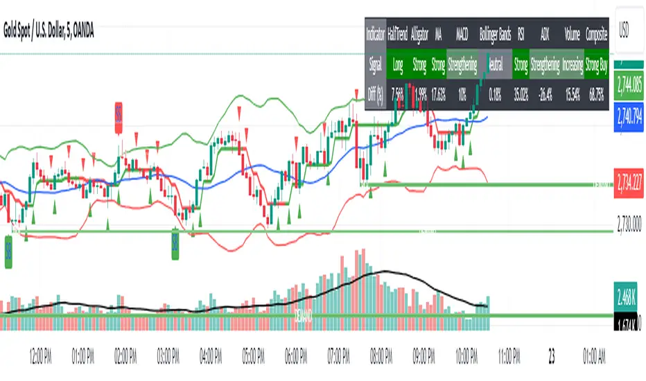
Trend, Momentum and Price value analysis Extended [deepakks444]Trend, Momentum, and Price Value Analysis Extended
This Pine Script™ indicator is designed to offer traders a comprehensive overview of price trends, momentum, and market strength through the use of several widely-recognized technical analysis tools. The indicator integrates multiple signals and plots directly on the chart, as well as a customizable table to help visually organize and interpret the data. Here’s an overview of the key features included:
Key Features:
VWAP (Volume-Weighted Average Price): Calculates the average price weighted by volume to give insight into whether the price is above or below the market's fair value.
Alligator Indicator: Uses a combination of three moving averages (jaw, teeth, and lips) to help identify trending conditions.
Supertrend: A trend-following indicator that signals potential buy or sell opportunities based on price movements relative to a dynamically calculated support/resistance line.
20-period Moving Average (MA): A basic moving average to smooth out price data and highlight the underlying trend.
MACD (Moving Average Convergence Divergence): Helps identify changes in the strength, direction, and momentum of a trend.
Volume with Moving Average: Compares current volume against its moving average to identify potential volume spikes.
RSI (Relative Strength Index): Measures the speed and change of price movements, signaling overbought or oversold conditions.
ADX (Average Directional Index): An indicator used to quantify trend strength, helping traders determine whether the market is trending or in a range.
Pivot Points: Calculates daily pivot points and identifies support and resistance levels based on price movements.
Bollinger Bands: A volatility indicator that uses standard deviation to highlight potential overbought or oversold conditions.
Customization Options:
Modify the length of the price and volume moving averages.
Adjust RSI thresholds for buy and sell signals.
Set the thresholds for ADX to differentiate between weak, average, and strong trends.
Toggle the visibility of the 20-period MA and Supertrend on the chart.
Choose to display the percentage difference between the current price and indicator values in the table.
Table Display:
The indicator includes a table that summarizes the status of all signals, showing:
Signal (Buy/Sell/Neutral): Based on each indicator's interpretation of price action.
Percentage Difference: Optional display of how far the price is from the reference level (e.g., the difference between the price and VWAP, Supertrend line, or Moving Average).
The table allows traders to quickly assess the current market conditions across several indicators in one place, making it easier to gauge overall market sentiment.
Signal Logic:
This indicator uses a scoring system to calculate the percentage of indicators signaling a buy or sell. If the buy or sell score reaches 70% or higher, the indicator will plot buy or sell signals on the chart. The combined signal logic is displayed in the table as "Buy," "Sell," or "No Signal," based on the majority of the contributing indicators.
Intended Use:
This tool is designed to assist traders in their technical analysis by consolidating multiple popular indicators into one script. It provides a clear visual representation of various market signals, helping traders to make informed decisions about potential trade entries and exits. However, this indicator is for educational purposes and should not be used as financial advice. Traders should always use proper risk management and conduct their own research before making any trading decisions.
Disclaimer: This script is for educational purposes only and does not constitute financial advice. Trading involves risk, and past performance of an indicator does not guarantee future results. Please use it alongside proper risk management practices.
MTF SqzMom [tradeviZion]Credits:
John Carter for creating the TTM Squeeze and TTM Squeeze Pro.
Lazybear for the original interpretation of the TTM Squeeze: Squeeze Momentum Indicator.
Makit0 for evolving Lazybear's script by incorporating TTM Squeeze Pro upgrades – Squeeze PRO Arrows.
MTF SqzMom - Multi-Timeframe Squeeze & Momentum Tool
MTF SqzMom is a tool designed to help traders easily monitor squeeze and momentum signals across multiple timeframes in a simple, organized format. Built using Pine Script 5, it ensures that data remains consistent, even when switching between different time intervals on the chart.
Key Features:
Multi-Timeframe Monitoring: Track squeeze and momentum signals across various timeframes, all in one view. This includes key timeframes like 1-minute, 5-minute, hourly, and daily.
Dynamic Table Display: A color-coded table that automatically adjusts based on the selected timeframes, offering a clear view of market conditions.
Alerts for Key Market Events: Get notifications when a squeeze starts or fires across your chosen timeframes, so you can stay informed without needing to monitor the chart continuously.
Customizable Appearance: Tailor the look of the table by selecting colors for squeeze levels and momentum shifts, and choose the best position on your chart for easy access.
How It Works:
MTF SqzMom is based on the concept of the squeeze, which signals periods of lower volatility where price breakouts may occur. The tool tracks this by monitoring the contraction of Bollinger Bands within Keltner Channels. Along with this, it provides momentum analysis to help you gauge the potential direction of the market after a squeeze.
Squeeze Conditions: The script tracks four levels of squeeze conditions (no squeeze, low, mid, and high), each represented by a different color in the table.
Momentum Analysis: Momentum is visually represented by colors indicating four stages: up increasing, up decreasing, down increasing, and down decreasing. This color coding helps you quickly assess whether the market is gaining or losing momentum.
Using Alerts:
You can enable two types of alerts: when a squeeze starts (indicating consolidation) and when a squeeze fires (indicating a breakout). These alerts cover all timeframes you’ve selected, so you never miss important signals.
How to Set It Up:
1. Enable Alerts in Settings: Turn on "Alert for Squeeze Start" and "Alert for Squeeze Fire" in the settings.
2. Add Alerts to Your Chart:
Click the three dots next to the indicator name.
Select "Add alert on tradeviZion - MTF SqzMom."
3. Customize and Save: Adjust alert options, choose your notification type, and click "Create."
Why Use MTF SqzMom ?
Consistent Data: The tool ensures that squeeze and momentum data remain consistent, even when you switch between chart intervals.
Real-Time Alerts: Stay updated with alerts for squeeze conditions without needing to constantly watch the chart.
Simple to Use, Customizable to Fit: You can easily adjust the table’s look and choose the timeframes and colors that best suit your trading style.
Acknowledgment:
While this tool builds on the TTM Squeeze concept developed by John Carter of Simpler Trading, it offers added flexibility through multi-timeframe analysis, alerts, and customizability to make monitoring market conditions more accessible.

Multi-Symbol Volume Increase Screener [CHE] MultiSymbol Volume Increase Screener
Designed for TradingView
Presented by Chervolino
Introduction
Welcome to the presentation of the MultiSymbol Volume Increase Screener—a powerful tool designed to enhance your trading strategy on TradingView. Developed at the request of jscott143, this screener provides traders with realtime insights into significant volume movements across multiple symbols, enabling more informed and timely trading decisions.
Purpose and Objectives
Identify HighVolume Opportunities: Detect symbols experiencing a significant increase in volume compared to their historical average.
Monitor Multiple Symbols Simultaneously: Efficiently track up to five symbols in one view.
RealTime Alerts: Receive instant notifications when predefined volume conditions are met.
Comprehensive Overview: Display volume data and percentage increases in an organized table for easy analysis.
Key Features
1. MultiSymbol Monitoring
Track up to five different symbols simultaneously.
Customize the list of symbols based on your trading portfolio.
2. Volume Analysis
Compare current candle volume against the average volume over a specified period.
Calculate and display the percentage increase in volume.
3. RealTime Alerts
Set a volume increase multiplier (e.g., 1.5x) to trigger alerts.
Receive alerts via email, popup, or SMS when conditions are met.
4. UserFriendly Table Display
View symbols, their current volume, and percentage increase in a clear, concise table.
Colorcoded indicators highlight significant volume changes.
5. Customizable Parameters
Adjust the average volume period to suit different trading strategies.
Set your preferred volume increase multiplier for alerts.
How It Works
1. User Inputs:
Symbols Selection: Choose up to five symbols you wish to monitor.
Average Volume Period: Define the number of bars over which the average volume is calculated (default is 20).
Volume Increase Multiplier: Set the threshold for volume increase to trigger alerts (default is 1.5x).
2. Volume Calculation:
The screener fetches the current volume and calculates the simple moving average (SMA) of volume over the defined period for each symbol.
It then determines if the current volume exceeds the average volume by the specified multiplier.
3. Data Display:
A table is generated on the chart displaying each symbol, its current volume, and the percentage increase.
Green text indicates that the volume increase condition has been met.
4. Alert Generation:
When a symbol's current volume surpasses the average volume by the set multiplier, an alert is triggered.
Alerts are customizable and can be set to notify you through various channels.
Benefits
Enhanced DecisionMaking: Quickly identify highvolume trading opportunities across multiple assets.
Time Efficiency: Monitor several symbols without the need to switch between charts.
Proactive Trading: Stay informed with realtime alerts, allowing for timely trading actions.
Customization: Tailor the screener settings to align with your unique trading strategies and preferences.
Setup Instructions
1. Add the Screener to TradingView:
Navigate to TradingView and open the Pine Editor.
Add the MultiSymbol Volume Increase Screener indicator to your chart.
Save and apply the indicator.
2. Configure User Inputs:
Select up to five symbols you wish to monitor in the input fields "Symbol 1" to "Symbol 5".
Adjust the "Average Volume Period" and "Volume Increase Multiplier" as needed.
3. Set Up Alerts:
Click on the Alarm icon (🔔) in the TradingView toolbar.
In the "Condition" dropdown, select the "MultiSymbol Volume Increase Screener".
Choose the specific alert condition for each symbol (e.g., "Volume Increase Alert for Symbol 1").
Configure the alert actions (e.g., email, popup, SMS) and click "Create".
Repeat this process for each symbol you wish to monitor.
Visual Demonstration
Table Display Example:
| Symbol | Volume | % Increase |
| AAPL | 150,000 | 50.00% |
| MSFT | 120,000 | 20.00% |
| GOOGL | 180,000 | 80.00% |
| AMZN | 130,000 | 30.00% |
| TSLA | 160,000 | 60.00% |
Green Text: Indicates that the volume increase condition has been met for that symbol.
Alert Notification Example:
```
🚀 Symbol 1 shows a volume increase!
```
Note: Replace "Symbol 1" with the actual symbol as per your configuration.
Customization Options
Increase the Number of Symbols:
While the current screener monitors five symbols, it can be extended to monitor more by adding additional input fields and corresponding calculations. However, be mindful of TradingView's Pine Script limitations and potential performance impacts.
Adjust Volume Period and Multiplier:
Tailor the "Average Volume Period" and "Volume Increase Multiplier" to align with your specific trading strategies and market conditions.
Enhance Table Information:
Incorporate additional data points such as current price, price change percentage, or other technical indicators to enrich your analysis.
Benefits of Using the Screener
Efficiency: Saves time by providing a consolidated view of multiple symbols' volume activity.
Proactive Trading: Enables you to act swiftly on significant volume movements, which often precede price changes.
DataDriven Decisions: Facilitates informed trading decisions based on realtime volume analysis.
Customization: Offers flexibility to adapt the screener to various trading styles and preferences.
Conclusion
The MultiSymbol Volume Increase Screener is an invaluable tool for traders looking to capitalize on significant volume movements across multiple assets. Developed at the request of jscott143, this screener integrates seamlessly with TradingView, providing realtime insights and alerts to enhance your trading strategy.
Q&A
Feel free to ask any questions or request further customization to better suit your trading needs.
Contact Information
Created for: jscott143
Thank you for your attention!
Descriptive Backtesting Framework (DBF)As the name suggests, this is a backtesting framework made to offer full backtesting functionality to any custom indicator in a visually descriptive way.
Any trade taken will be very clear to visualize on the chart and the equity line will be updated live allowing us to use the REPLAY feature to view the strategy performing in real time.
Stops and Targets will also get draw on the chart with labels and tooltips and there will be a table on the top right corner displaying lots of descriptive metrics to measure your strategy's performance.
IF YOU DECIDE TO USE THIS FRAMEWORK, PLEASE READ **EVERYTHING** BELOW
HOW TO USE IT
Step 1 - Insert Your Strategy Indicators:
Inside this framework's code, right at the beginning, you will find a dedicated section where you can manually insert any set of indicators you desire.
Just replace the example code in there with your own strategy indicators.
Step 2 - Specify The Conditions To Take Trades:
After that, there will be another section where you need to specify your strategy's conditions to enter and exit trades.
When met, those conditions will fire the trading signals to the trading engine inside the framework.
If you don't wish to use some of the available signals, please just assign false to the signal.
DO NOT DELETE THE SIGNAL VARIABLES
Step 3 - Specify Entry/Exit Prices, Stops & Targets:
Finally you'll reach the last section where you'll be able to specify entry/exit prices as well as add stops and targets.
On most cases, it's easier and more reliable to just use the close price to enter and exit trades.
If you decide to use the open price instead, please remember to change step 2 so that trades are taken on the open price of the next candle and not the present one to avoid the look ahead bias.
Stops and targets can be set in any way you want.
Also, please don't forget to update the spread. If your broker uses commissions instead of spreads or a combination of both, you'll need to manually incorporate those costs in this step.
And that's it! That's all you have to do.
Below this section you'll now see a sign warning you about not making any changes to the code below.
From here on, the framework will take care of executing the trades and calculating the performance metrics for you and making sure all calculations are consistent.
VISUAL FEATURES:
Price candles get painted according to the current trade.
They will be blue during long trades, purple on shorts and white when no trade is on.
When the framework receives the signals to start or close a trade, it will display those signals as shapes on the upper and lower limits of the chart:
DIAMOND: represents a signal to open a trade, the trade direction is represented by the shape's color;
CROSS: means a stop loss was triggered;
FLAG: means a take profit was triggered;
CIRCLE: means an exit trade signal was fired;
Hovering the mouse over the trade labels will reveal:
Asset Quantity;
Entry/Exit Prices;
Stops & Targets;
Trade Profit;
Profit As Percentage Of Trade Volume;
**Please note that there's a limit as to how many labels can be drawn on the chart at once.**
If you which to see labels from the beginning of the chart, you'll probably need to use the replay feature.
PERFORMANCE TABLE:
The performance table displays several performance metrics to evaluate the strategy.
All the performance metrics here are calculated by the framework. It does not uses the oficial pine script strategy tester.
All metrics are calculated in real time. If using the replay feature, they will be updated up to the last played bar.
Here are the available metrics and their definition:
INITIAL EQUITY: the initial amount of money we had when the strategy started, obviously...;
CURRENT EQUITY: the amount of money we have now. If using the replay feature, it will show the current equity up to the last bar played. The number on it's right side shows how many times our equity has been multiplied from it's initial value;
TRADE COUNT: how many trades were taken;
WIN COUNT: how many of those trades were wins. The percentage at the right side is the strategy WIN RATE;
AVG GAIN PER TRADE: the average percentage gain per trade. Very small values can indicate a fragile strategy that can behave in unexpected ways under high volatility conditions;
AVG GAIN PER WIN: the average percentage gain of trades that were profitable;
AVG GAIN PER LOSS: the average percentage loss on trades that were not profitable;
EQUITY MAX DD: the maximum drawdown experienced by our equity during the entire strategy backtest;
TRADE MAX DD: the maximum drawdown experienced by our equity after one single trade;
AVG MONTHLY RETURN: the compound monthly return that our strategy was able to create during the backtested period;
AVG ANNUAL RETURN: this is the strategy's CAGR (compound annual growth rate);
ELAPSED MONTHS: number of months since the backtest started;
RISK/REWARD RATIO: shows how profitable the strategy is for the amount of risk it takes. Values above 1 are very good (and rare). This is calculated as follows: (Avg Annual Return) / mod(Equity Max DD). Where mod() is the same as math.abs();
AVAILABLE SETTINGS:
SPREAD: specify your broker's asset spread
ENABLE LONGS / SHORTS: you can keep both enable or chose to take trades in only one direction
MINIMUM BARS CLOSED: to avoid trading before indicators such as a slow moving average have had time to populate, you can manually set the number of bars to wait before allowing trades.
INITIAL EQUITY: you can specify your starting equity
EXPOSURE: is the percentage of equity you wish to risk per trade. When using stops, the strategy will automatically calculate your position size to match the exposure with the stop distance. If you are not using stops then your trade volume will be the percentage of equity specified here. 100 means you'll enter trades with all your equity and 200 means you'll use a 2x leverage.
MAX LEVERAGE ALLOWED: In some situations a short stop distance can create huge levels of leverage. If you want to limit leverage to a maximum value you can set it here.
SEVERAL PLOTTING OPTIONS: You'll be able to specify which of the framework visuals you wish to see drawn on the chart.
FRAMEWORK **LIMITATIONS**:
When stop and target are both triggered in the same candle, this framework isn't able to enter faster timeframes to check which one was triggered first, so it will take the pessimistic assumption and annul the take profit signal;
This framework doesn't support pyramiding;
This framework doesn't support both long and short positions to be active at the same time. So for example, if a short signal is received while a long trade is open, the framework will close the long trade and then open a short trade;
FINAL CONSIDERATIONS:
I've been using this framework for a good time and I find it's better to use and easier to analyze a strategy's performance then relying on the oficial pine script strategy tester. However, I CANNOT GUARANTEE IT TO BE BUG FREE.
**PLEASE PERFORM A MANUAL BACKTEST BEFORE USING ANY STRATEGY WITH REAL MONEY**

Multiple Bollinger Bands + Volatility [AlgoTraderPro]This indicator helps traders visualize price ranges and volatility changes. Designed to assist in identifying potential consolidation zones, the indicator uses multiple layers of Bollinger Bands combined with volatility-based shading. This can help traders spot periods of reduced price movement, which are often followed by breakouts or trend reversals.
█ FEATURES
Multiple Bollinger Bands: Displays up to seven bands with customizable standard deviations, providing a layered view of price range activity.
Volatility Measurement: Tracks changes in Bollinger Band width to display volatility percentage and direction (increasing, decreasing, or neutral).
Volatility Shading: Uses color-coded shading between the outermost bands to indicate changes in volatility, helping to visualize potential consolidation zones.
Customizable Inputs: Modify lookback periods, moving average lengths, and standard deviations for each band to tailor the analysis to your strategy.
Volatility Table: Displays a table on the chart showing real-time volatility data and direction for quick reference.
█ HOW TO USE
Add the Indicator: Apply it to your TradingView chart.
Adjust Settings: Customize the Bollinger Bands’ parameters to suit your trading timeframe and strategy.
Analyze Consolidation Zones: Use the multiple bands and volatility shading to identify areas of reduced price activity, signaling potential breakouts.
Monitor Volatility: Refer to the volatility table to track real-time shifts in market volatility.
Use in Different Markets: Adapt the settings for various assets and timeframes to assess market conditions effectively.
█ NOTES
• The indicator is useful in consolidating markets where price movement is limited, offering insights into potential breakout areas.
• Adjust the settings based on asset and market conditions for optimal results.
Risk TrackerThis Risk Tracker Pine Script provides traders with a customizable tool for tracking and managing trade risk directly on their chart. The script is designed to accommodate both futures and crypto trades, allowing you to monitor risk and reward parameters, adjust contract sizes, and manage leverage in real-time.
Key Features:
1. Trade Direction and Risk-Reward Ratio:
• Select between Long or Short trade directions.
• Set a custom Risk-Reward Ratio (RRR) to calculate potential profit and loss levels based on your trade setup.
2. Customizable Parameters:
• Input fields for contract size, leverage, margin, and maximum drawdown allow you to adjust the risk settings depending on the market you are trading.
• You can toggle between using a dollar-based or percentage-based risk calculation depending on whether you’re trading futures (USD-based) or crypto.
3. Real-time Stop-Loss and Take-Profit Calculation:
• The script automatically calculates and draws the Stop-Loss (SL) and Take-Profit (TP) levels on the chart based on your entry price and selected risk settings.
• The color of the SL and TP lines is customizable, allowing you to visually distinguish profit and loss levels.
4. Historical Price Levels:
• If there is no active trade, the script scans historical price data to find the last instances when the price hit the predefined stop-loss or take-profit levels, helping you understand past price behavior.
5. Risk Management Table:
• A summary table is displayed on the chart, showing the key metrics of your trade, including:
• Tick value and Dollar value for futures.
• Margin and Leverage for crypto.
• Risk-Reward Ratio, Entry price, Risk and Profit in USD or percentage terms.
• The table dynamically updates based on the current trade status.
6. Extended Chart Visualization:
• Option to extend the SL and TP lines to the left of the chart, allowing you to easily view these levels across multiple timeframes and bars.
This script helps ensure you are always aware of your trade’s risk profile, providing a clear and visual representation of potential profit and loss, both in terms of percentage and dollar value. Ideal for futures and crypto traders who rely on precise risk management to maintain profitability.

Thai Gold 96.5%Gold 96.5% Price Display (Test Version)
This Pine Script indicator is a test version designed to display the current price of Thai gold (96.5%) in a customizable table on your TradingView chart. The script calculates the gold price using the latest values for XAU/USD and USD/THB, reflecting the price of gold in Thai Baht (THB) with a purity adjustment.
Features:
- Price Calculation: Computes the Thai gold price by multiplying the XAU/USD price with USD/THB and adjusting for gold purity (0.49 * 0.965).
- Customizable Display: Adjust text size, text color, background color, and table position (Top Right, Top Left, Bottom Right, Bottom Left).
- Formatted Output: Gold price is formatted with commas for better readability.
Inputs:
- Text Size: Choose from tiny, small, normal, large, or huge.
- Text Color: Customize the text color.
- Background Color: Select a background color for the table.
- Table Position: Choose the table position on the chart.
Usage:
Add this test script to your TradingView chart to see the current Thai gold price displayed in a table format. This version is for testing purposes and may be updated based on feedback.
Feel free to test and customize the script further!
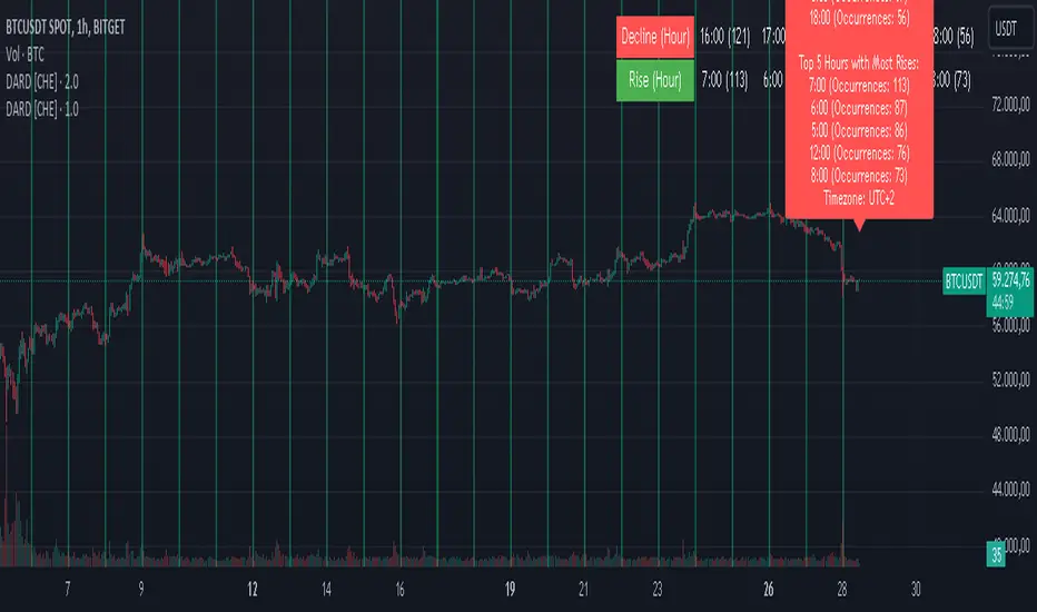
Decline and Rise Detective [CHE]Decline and Rise Detective
TradingView Indicator (Best Timeframe: 1H or Higher)
1. Introduction
The "Decline and Rise Detective " is a TradingView indicator designed to identify the hours within a trading day that experience the largest price declines and rises. This indicator provides a visual representation of this data, offering traders valuable insights into the most frequent hours for significant price movements. It is most effective when used with a timeframe of 1 hour or greater.
2. Key Features of the Indicator
2.1. Display Options
Display Option: Users can choose between two display options:
Label: Displays the information as a text label directly on the chart.
Table: Displays the information in a table format in the top right corner of the chart.
2.2. Time Zone Settings
Time Zone: The indicator allows the user to manually set the time zone or use the exchange's time zone.
Time Zone Offset: Adjust the time zone via a UTC offset.
2.3. Day Change Detection
The indicator automatically detects the change between trading days to ensure data is correctly assigned.
3. Analysis of Price Declines and Rises
3.1. Calculation of Largest Declines and Rises
The indicator compares the high and low of each hour to determine the largest decline and rise within a trading day.
3.2. Frequency Counting
For each hour of the day, the number of times the largest declines and rises occur is counted to identify the hours with the most significant price movements.
3.3. Data Sorting
The hours are sorted by the number of occurrences of declines and rises to highlight the most frequent hours. This sorting was implemented using the MA Sorter function, inspired by Duyck's Array Sorter. Special thanks to Duyck for providing the Array Sorter on TradingView, which greatly influenced this feature
4. Interpretation and Trading Applications
4.1. Identifying High Volatility Periods
The hours identified by the indicator as having the most frequent and significant price movements are typically periods of high volatility. These periods are crucial for traders who seek to capitalize on market fluctuations.
4.2. Determining Optimal Trade Entries
Long Trades: The hours with the most significant price rises can be used to identify optimal times to enter long positions.
Short Trades: Conversely, the hours with the most significant price declines can indicate good opportunities for short trades.
4.3. Display of Top 5 Hours
The indicator shows the five hours with the most declines and rises.
Depending on the selected display option, this information is shown either as a text label or as a table in the chart.
4.4. Background Color
The background color of the chart changes at day change to clearly mark it.
5. Application of the Indicator
5.1. Trading Use
Traders can use the indicator to identify time windows with high volatility and adjust their trading strategies accordingly. This allows for more informed decisions on when to go long or short, depending on the market conditions during those hours.
5.2. Customization Options
Various input options allow the user to customize the indicator to fit personal needs and trading hours.
6. Summary
The "Decline and Rise Detective " indicator is a powerful tool for analyzing hourly price movements in the markets. By providing detailed information on the most frequent hours for significant price declines and rises, this indicator offers valuable insights into periods of high volatility. Traders can use this data to make more informed decisions on entering long or short trades. It is particularly effective when used with timeframes of 1 hour or greater.
Best regards and happy trading
Chervolino
HMA Z-Score Probability Indicator by Erika BarkerThis indicator is a modified version of SteverSteves's original work, enhanced by Erika Barker. It visually represents asset price movements in terms of standard deviations from a Hull Moving Average (HMA), commonly known as a Z-Score.
Key Features:
Z-Score Calculation: Measures how many standard deviations the current price is from its HMA.
Hull Moving Average (HMA): This moving average provides a more responsive baseline for Z-Score calculations.
Flexible Display: Offers both area and candlestick visualization options for the Z-Score.
Probability Zones: Color-coded areas showing the statistical likelihood of prices based on their Z-Score.
Dynamic Price Level Labels: Displays actual price levels corresponding to Z-Score values.
Z-Table: An optional table showing the probability of occurrence for different Z-Score ranges.
Standard Deviation Lines: Horizontal lines at each standard deviation level for easy reference.
How It Works:
The indicator calculates the Z-Score by comparing the current price to its HMA and dividing by the standard deviation. This Z-Score is then plotted on a separate pane below the main chart.
Green areas/candles: Indicate prices above the HMA (positive Z-Score)
Red areas/candles: Indicate prices below the HMA (negative Z-Score)
Color-coded zones:
Green: Within 1 standard deviation (high probability)
Yellow: Between 1 and 2 standard deviations (medium probability)
Red: Beyond 2 standard deviations (low probability)
The HMA line (white) shows the trend of the Z-Score itself, offering insight into whether the asset is becoming more or less volatile over time.
Customization Options:
Adjust lookback periods for Z-Score and HMA calculations
Toggle between area and candlestick display
Show/hide probability fills, Z-Table, HMA line, and standard deviation bands
Customize text color and decimal rounding for price levels
Interpretation:
This indicator helps traders identify potential overbought or oversold conditions based on statistical probabilities. Extreme Z-Score values (beyond ±2 or ±3) often suggest a higher likelihood of mean reversion, while consistent Z-Scores in one direction may indicate a strong trend.
By combining the Z-Score with the HMA and probability zones, traders can gain a nuanced understanding of price movements relative to recent trends and their statistical significance.
Stef's Enterprise Value CalculatorI have learned the hard way why Enterprise Value is far more superior than Market Cap. That's why I made this indicator, but more importantly, why I added several features that other similar indicators just don't have. The key thing is to not just show you Enterprise Value of a company (it's true worth) but also the capability to see that line colored in a specific way, with key stats as a neat table, and the ability to chart the key facts that go into Enterprise Value, which are debt and cash.
I'll say it again: Market Cap is not nearly as good as Enterprise Value. Don't get tricked by what Market Cap does NOT show you and instead focus on Enterprise Value. I hope my indicator, and the features you see below, help investors and traders all over the world better understand this.
Here are the key features:
Enterprise Value Indicator Features:
1. Real-Time Enterprise Value (EV) Display: Track the EV of a company directly on your chart, providing a comprehensive measure of its true market value.
2. Custom Color Trends: Customize the color of your EV line based on specific trends you’re monitoring, allowing for personalized and insightful visual analysis.
3. Debt & Cash Visualization: Plot both debt and cash & equivalents on the same chart, offering a clear and concise view of a company’s financial health.
4. Key Metrics Table: View a table displaying essential metrics including:
- Average EV
- Highest EV
- Lowest EV
- MC-EV (Market Cap minus Enterprise Value)
MC-EV Charting: Easily chart MC-EV to understand how much debt a company has relative to its market cap, providing insight into financial leverage and growth potential.
Why MC-EV Matters: This metric is crucial for evaluating a company’s financial risk and operational efficiency, giving you an edge in making informed investment decisions.
Thanks for reading and I hope you find some value in this! More updates to come.

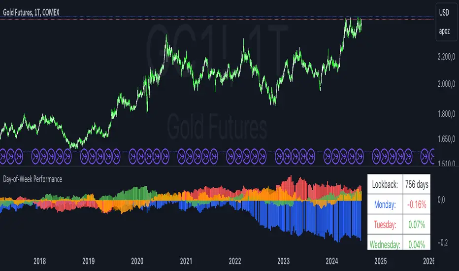
Day-of-Week PerformanceThis Pine Script indicator calculates and displays the average performance for each weekday over a specified lookback period on a chart. The performance is computed based on the percentage change from the open to the close price of each day.
Features:
Lookback Period:
Input field to specify the number of days to look back for calculating performance. The default is set to 756 days.
Performance Calculation:
Calculates the average percentage change from open to close for each weekday (Monday through Friday) within the specified lookback period.
Histogram Plots:
Displays histograms on the chart for each weekday. Each histogram represents the average performance of that day of the week.
Histograms are plotted with distinct colors:
Monday: Blue
Tuesday: Red
Wednesday: Green
Thursday: Orange
Friday: Purple
Performance Table:
A table is displayed in the top-right corner of the chart showing the average percentage performance for each weekday.
The table updates with the lookback period and the calculated average performance values for each weekday.
Positive performance values are shown in green, and negative values are shown in red.
This indicator helps visualize day-of-the-week performance trends, providing insights into which days typically perform better or worse over the specified period.
Portfolio Index Generator [By MUQWISHI]▋ INTRODUCTION:
The “Portfolio Index Generator” simplifies the process of building a custom portfolio management index, allowing investors to input a list of preferred holdings from global securities and customize the initial investment weight of each security. Furthermore, it includes an option for rebalancing by adjusting the weights of assets to maintain a desired level of asset allocation. The tool serves as a comprehensive approach for tracking portfolio performance, conducting research, and analyzing specific aspects of portfolio investment. The output includes an index value, a table of holdings, and chart plotting, providing a deeper understanding of the portfolio's historical movement.
_______________________
▋ OVERVIEW:
The image can be taken as an example of building a custom portfolio index. I created this index and named it “My Portfolio Performance”, which comprises several global companies and crypto assets.
_______________________
▋ OUTPUTS:
The output can be divided into 4 sections:
1. Portfolio Index Title (Name & Value).
2. Portfolio Specifications.
3. Portfolio Holdings.
4. Portfolio Index Chart.
1. Portfolio Index Title, displays the index name at the top, and at the bottom, it shows the index value, along with the chart timeframe, e.g., daily change in points and percentage.
2. Portfolio Specifications, displays the essential information on portfolio performance, including the investment date range, initial capital, returns, assets, and equity.
3. Portfolio Holdings, a list of the holding securities inside a table that contains the ticker, average entry price, last price, return percentage of the portfolio's initial capital, and customized weighted percentage of the portfolio. Additionally, a tooltip appears when the user passes the cursor over a ticker's cell, showing brief information about the company, such as the company's name, exchange market, country, sector, and industry.
4. Index Chart, display a plot of the historical movement of the index in the form of a bar, candle, or line chart.
_______________________
▋ INDICATOR SETTINGS:
Section(1): Style Settings
(1) Naming the index.
(2) Table location on the chart and cell size.
(3) Sorting Holdings Table. By securities’ {Return(%) Portfolio, Weight(%) Portfolio, or Ticker Alphabetical} order.
(4) Choose the type of index: {Equity or Return (%)}, and the plot type for the index: {Candle, Bar, or Line}.
(5) Positive/Negative colors.
(6) Table Colors (Title, Cell, and Text).
(7) To show/hide any indicator’s components.
Section(2): Performance Settings
(1) Calculation window period: from DateTime to DateTime.
(2) Initial Capital and specifying currency.
(3) Option to enable portfolio rebalancing in {Monthly, Quarterly, or Yearly} intervals.
Section(3): Portfolio Holdings
(1) Enable and count security in the investment portfolio.
(2) Initial weight of security. For example, if the initial capital is $100,000 and the weight of XYZ stock is 4%, the initial value of the shares would be $4,000.
(3) Select and add up to 30 symbols that interested in.
Please let me know if you have any questions.

[SGM Ordinal Patterns]An ordinal pattern is a concept used in mathematics and time series analysis. It is a way of describing the relative order of values in a sequence. Rather than focusing on the exact values, we are interested in how they compare to each other.
An ordinal pattern will tell you how these values are positioned relative to each other.
We do not look at the exact values, but only their order.
Concrete Example
• 4 (position 1 in the original sequence) is in position 2 in the ordered sequence.
• 7 (position 2 in the original sequence) is in position 3 in the ordered sequence.
• 2 (position 3 in the original sequence) is in position 1 in the ordered sequence.
The ordinal pattern for this sequence is then (2,3,1)(2, 3, 1)(2,3,1).
Script Explanation
This script analyzes ordinal patterns based on the closing prices of the last three bars and calculates the future gains associated with each ordinal pattern.
The main elements of the script are:
1. ordinal_pattern Function:
o Determines the ordinal pattern based on three past closing values.
o Returns an index (from 0 to 5) corresponding to one of the six possible ordinal patterns.
2. Calculations and Storage:
o For each new bar, the last three closes are used to identify the ordinal pattern.
o Future gains are calculated and associated with the previous ordinal pattern.
o Return statistics (mean, standard deviation and Sharpe ratio) are calculated for each pattern.
3. Visualization:
o Draws lines connecting the last three closes.
o Tables displaying the number of occurrences, distributions, and return statistics for each ordinal pattern.
What the Script Shows:
• Table motifs_table : Number of occurrences and distribution of each ordinal pattern. An uneven distribution between patterns (different by one sixth for each pattern) can indicate market inefficiency.
• Table pattern_analysis : Analysis of returns (mean, standard deviation, Sharpe ratio) for each ordinal pattern.
• Table current_motif_table : Ordinal pattern of the last bar.
This script helps to understand and visualize how ordinal patterns influence future returns of financial asset prices. An uneven distribution of patterns can indicate market inefficiencies.

ICT New Day Opening GapNew Day Opening Gap
The New Day Opening Gap (NDOG) is defined by The Inner Circle Trader (ICT) as the separation in time/price that is caused by the 1-hour break that occurs each day in the futures market. The opening price of the gap is the very first tick that occurs at the 6:00pm restart; then we look at the 5:00pm closing price of the previous session. This New Day Opening Gap forms every day from Monday to Friday, but it does not include the gap between Friday's close and Sunday's open (because that is instead referred to as a New Week Opening Gap).
This is an example of a New Day Opening Gap (NDOG) for Wednesday, May 22, 2024 in CME_MINI:ES1!
How To Use NDOG
When an NDOG forms, it can be extended into future price action. One way to use these gaps is to look for it to be filled in by price action. Another usage for these gaps is to look for support & resistance to come in at the high and low of these NDOGs (as well as the midpoint).
Disclaimer
This indicator is mainly intended to work for Futures markets, and specifically the following Index Futures markets: E-mini S&P 500 Futures, E-mini NASDAQ-100 Futures, E-mini DOW Futures.
Given that, the indicator still supports various other markets/assets out-of-the-box, such as other types of Futures Markets, Forex markets, Stocks, Options, and more. The main difference will be that other markets may have NDOGs forming at different times, rather than the 5pm-6pm gap that occurs in the Index Futures.
Indicator Features
This indicator is 100% custom-built, not using code from any other existing NDOG plotting indicators. The purpose of this indicator was to overcome many shortcomings from other existing indicators. Therefore, this indicator has many UNIQUE features, such as:
Ability to maintain accuracy of the closing/opening prices even when changing chart settings (e.g., toggling ETH/RTH sessions, toggling BACK-ADJUSTMENT on futures contracts, toggling SETTLEMENT prices, etc.).
Draw up to 25 previous NDOGs, even on ultra-low timeframes like the 1-minute or 1-second chart.
Automatically or manually choose which NDOGs to hide/show on the chart.
Highly customizable, including a different color scheme to easily distinguish between the Current and Previous NDOGs.
Modified price values to correctly display prices that use a format like 109'32 (e.g., Bond Futures or Wheat Futures).
Helpful tooltips to provide more detailed information about the NDOGs or about the current Input Settings.
Error Messages
There are some conditions which can cause the script to fail and display an error message (by clicking the red exclamation mark next to the indicator.)
Error messages:
Use a Standard Chart Type : this will occur when using a non-standard chart such as Heikin Ashi, Renko, Point & Figure, etc.
Use a Daily or Lower Timeframe : this error will appear when using a higher timeframe chart like weekly or monthly, because it can clutter the chart since NDOGs can form every day.
NDOG was not detected : this means that no NDOG was found, for example if the chart did not have enough bars/candles (e.g., some Options markets).
Exceeded the maximum lookback for Bar Replay mode : when using bar replay mode; this can depend on the amount of historical bars available in different account subscription types.
Unable to Activate Bar Replay mode : if the indicator could not be used in Bar Replay mode.
Restart Bar Replay : if the indicator works in Bar Replay but it detected an error that would cause NDOGs to be plotted incorrectly.
NDOG was not detected. Toggle "Error Handling" Option at your own discretion : this is more of a warning message that will appear when the indicator does not detect any actual gap between the days (e.g., Forex markets where it is continuously traded through each day, without any gap forming in between). But the warning can be dismissed by toggling the checkbox at the bottom of the Indicator's Input Settings.
This is an example of what a script error would look like.
Indicator Settings
Most settings are self-explanatory or have a tooltip with information on what the setting does, so this section will only briefly cover the available settings.
The "Extend to End of Week" option is enabled by default, which will extend each NDOG only up to the end of the week that it belongs to. This option can be toggled OFF to automatically extend all NDOGs to the right-most candle on the chart.
Previous NDOGs: Between 1 and 25 previous NDOGs can be displayed. The checkbox can be toggled to quickly hide all previous NDOGs (but the same effect would be reached by setting the value to 0).
Hide Current NDOG: the current NDOG (colored in Green in the example above), can be optionally hidden from being plotted.
These settings are used to customize the visual style of the most recent NDOG (also known as the "Current" NDOG). Note: the exact same set of settings are available for the Previous NDOGs. The text next to each NDOG can be optionally hidden to clean the chart a little.
These are settings to customize the appearance of the Price Table on the right, including the ability to hide it completely.
One of 7 available overlap handling options can be used to filter which NDOGs are plotted on the chart. By default, the "None" option will be selected, meaning that all valid NDOGs are plotted on the chart.
Date Format : select the format of the date that is shown next to each NDOG.
Timezone : choose the timezone for the NDOG closing/opening date-times that are displayed (only in tooltips when you hover over an NDOG label).
NDOG Label : choose the details to display next to each NDOG (e.g., date, or NDOG number, or both).
Price Format : only two options: Auto/Decimal. "Auto" uses custom processing to allow displaying values such as 109'32 for Bond futures.
This option can be toggled to allow displaying NDOGs for markets that may not have an actual gap between days, such as Forex markets, or BTC/USD (which is traded 24/7). Note: this option must be used at your own discretion because the opening/closing times for the NDOGs are not guaranteed to be accurate.
Tooltips
The indicator provides additional details about an NDOG when you hover over a row in the Price Table.
Note: the same information can be found by hovering over the Text Label that is to the right of each NDOG.
Overlap Handling
The tooltip next to "Select a Strategy" in the options will provide details on each overlap handling strategy. Additionally, when a strategy is selected, a new row in the Price Table will appear; hovering over that will show details about the currently selected strategy, as well as any suggestions in case the inputs were invalid. When a strategy hides an NDOG, the number in the Price Table will be replaced with an "Eye" icon, indicating that it is not currently plotted on the chart.
Available strategies are:
Option 1 (Gradients) : select the percentage opacity to shade NDOGs in. The more recent NDOGs will be closer to the maximum opacity defined, while the older NDOGs will appear more transparent, closer to the minimum opacity defined. Note: only affects previous NDOGs, not the current NDOG.
Option 2 (Week Extension) : select the number of weeks to extend each NDOG up to. Note: this will override the "Extend to End of Week" setting, regardless whether it is toggled ON or OFF.
Option 3 (Nested Gaps) : hides nested gaps, i.e., NDOGs that are enclosed within another NDOG. Note: this option is only available when the "Extend to End of Week" setting is disabled .
Option 4 (Intersecting Gaps) : hides intersecting/overlapping gaps, i.e., NDOGs that overlap one another (this may also include, but is not limited to, nested gaps). The drop-down next to this option allows choosing the priority of which NDOGs to hide first. Note: this option is only available when the "Extend to End of Week" setting is disabled .
Option 5 (Gap Width) : the chart will only show NDOGs that have a width between the defined parameters. This can be useful to filter out NDOGs that are deemed "insignificant". For example, the Inner Circle Trader will generally filter out of his analysis any NDOGs that are less than a point (4 ticks) for Index futures.
Option 6 (Close Proximity) : the chart will only show the NDOGs that are within a certain range from the market price. This can be useful when plotting multiple NDOGs while using auto-scaling on the chart. By only showing nearby NDOGs, it will prevent the auto-scaling from having to compress the candles to fit the far-away NDOGs onto the screen.
Option 7 (CSV) : this option is used if none of the others suit you well; it allows specifically choosing which NDOGs to hide or show on the chart.
This is an example that chooses the Overlap Handling Strategy Option 6. Note that in this example, the tooltip in the price table shows a warning that the Input Number should be increased to plot some NDOGs on the chart.
Tips
Chart settings can be toggled to "Scale price chart only" to prevent the auto-scaling of TradingView from compressing the chart if there are NDOGs that are far away from the current market action.
If you change a lot of indicator settings such as NDOG color schemes, you can save the settings as the Default to prevent your settings from resetting the next time you use the indicator.